News
Spacio Talks: Cambrionix
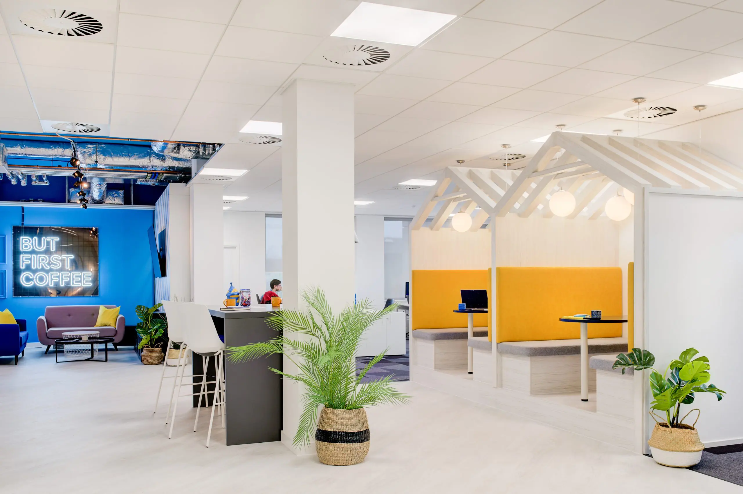
An office design fit for work at play! Cambrionix helps customers and partners develop and deliver reliable mobile IT solutions. They needed an office that worked for future growth, while still promoting the brand throughout the workspace.
We interview our Head of Design, Zowie to take a closer look at the design of this fun, vibrant and bold space.
What was the main focus when designing Cambrionix
Ensuring the design worked for the future growth, the different teams and reflecting the brand. The focus needed to initially focus on how the space will work not only now but in 5 years’ time too. When investing in a new office design, we want to work alongside the client to make sure that everything has been covered now, not as an afterthought a few years down the line.
What was the inspiration behind this bold space?
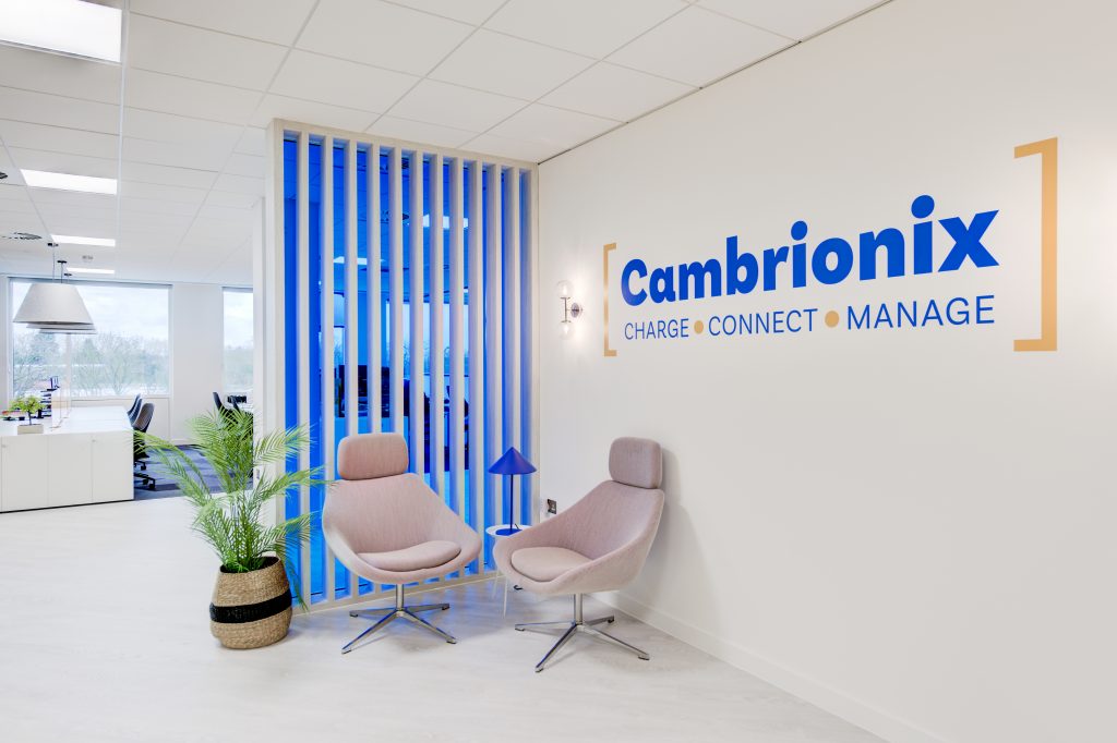
Luckily the branding that Cambrionix had was bold to begin with, the design team were able to springboard off that and start to pull together some simple but impactful bespoke ideas. The colours and graphics are an extension of all that Cambrionix and the team are about.
What type of environment did you want to create?
An office that was relaxed, open and transformative. We decided on a clear distinction between work and play, allowing the staff to have a space to get away from work, as well as a space to focus.
What was your favourite element of this design?
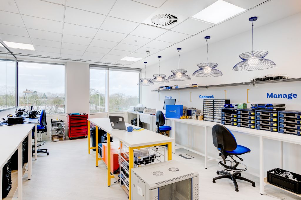
A very hard choice but I would say the lab. Within the design team we thrive off a challenge and approaching new design elements. Through the lab we worked closely with the engineering team to ensure the layout, spacing and M&E was right for each need. Then we turned our expertise to the finishes, powder coating the middle bench framework in the brand yellow and specifying blue wire globe lighting to run the length of the space. No space should be left out of the overall design finish.
What are the bespoke areas?
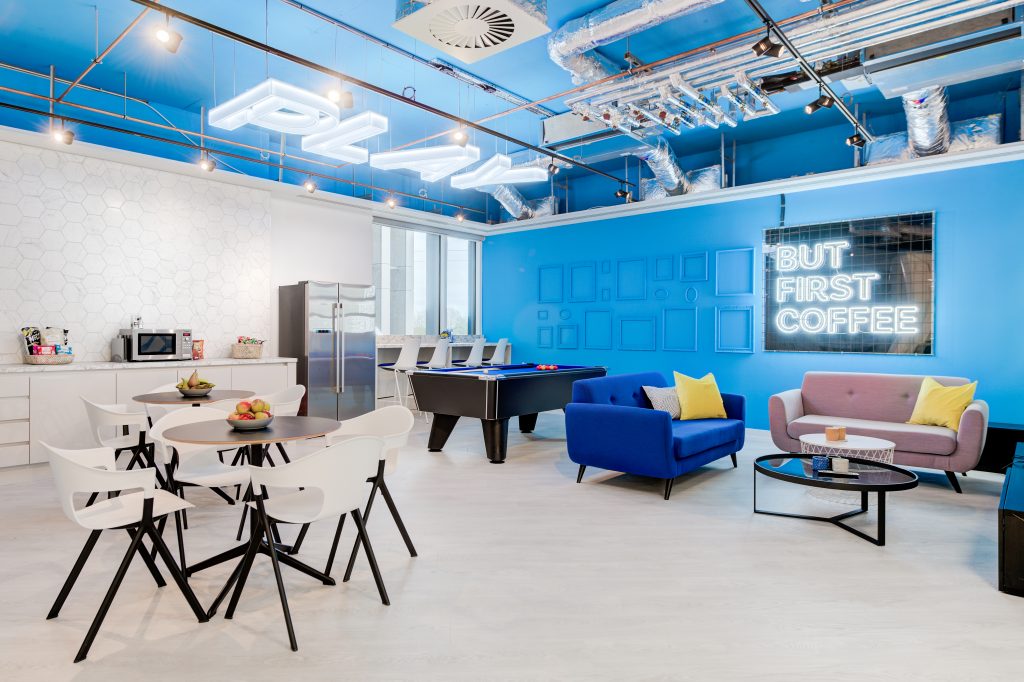
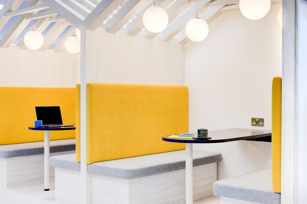
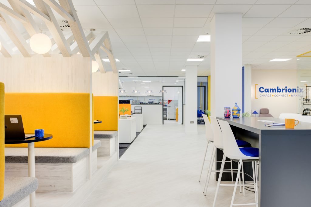
There are many through the space, from big to small bespoke design pieces, which is all part of making an office space work specifically for that client. The largest one to note are the meeting booths, illuminated signage within the breakout area, lab benches and soft furnishings.
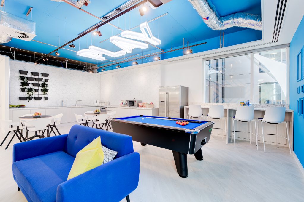
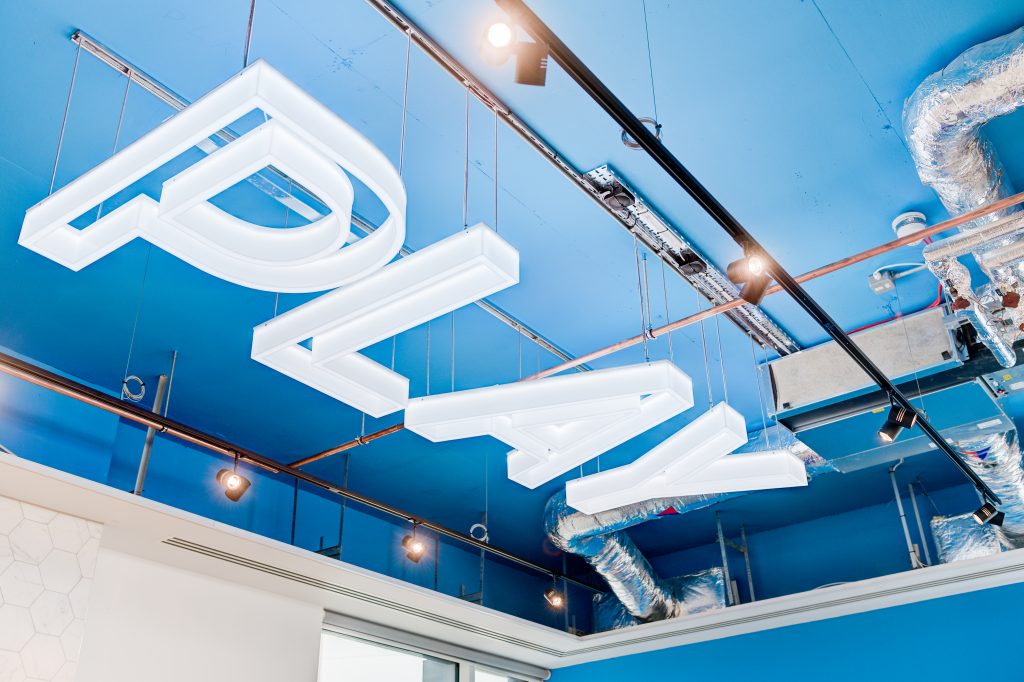
Illuminated signage was to add another dimension to the breakout space, using lighting as a tool to break up an all blue space with only one window.
Lab benches were a bespoke design and size to fit perfectly in the space we had allocated. We chose simple finishes that would work well over time for the amount of use that these benches will have over the years.
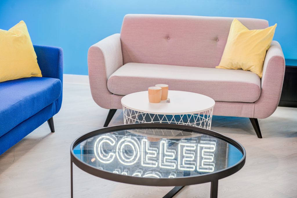
A mixture of furniture within the space had hand chosen fabrics applied, mixing textures and colours in the overall finish. One fabric was chosen which had a four-stitch weave, which encompassed all of the brand colours from Cambrionix, which was too perfect to pass up.
The biggest need for the new office was space for business growth, how did you achieve this?
Careful considerations were given to the business growth from the very initial plans right the way through to the furniture planning. Desking was designed into the schematics to showcase where it will go as and when need be, which was then translated into floorboxes and M&E planning to be input. There is also a large storeroom which has capabilities to be changed into a private office or new meeting room if the client has the new need for the space.
What are the key areas in this design reflect the needs of the employers?
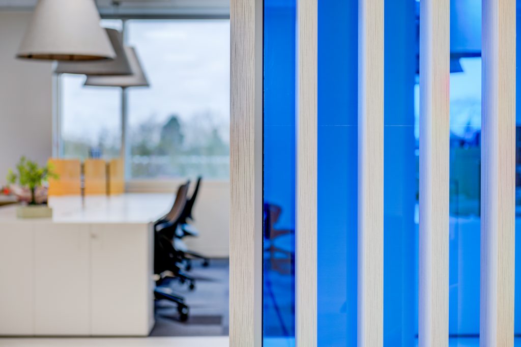
Within the structure of Cambrionix, two teams are headed up by the two directors, due to this business divide we decided to place both directors in the middle of the two teams, in a glass office. This allowed an acoustic barrier, a partial visual barrier but also an opportunity for neither team to be hidden away. The meeting booths were then planned in on one side of the glass office, to work as a bridge between the teams, allowing quick meet ups, or a simple change in scenery for either team.
Can you talk to us about the different textures used and why you chose them?
Choosing textures within office design is key for the longevity of the space. Every finish was carefully selected to not only look good but last, therefore we specified high quality and commercial items.
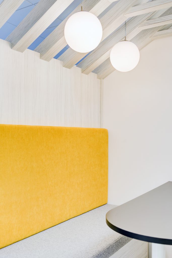
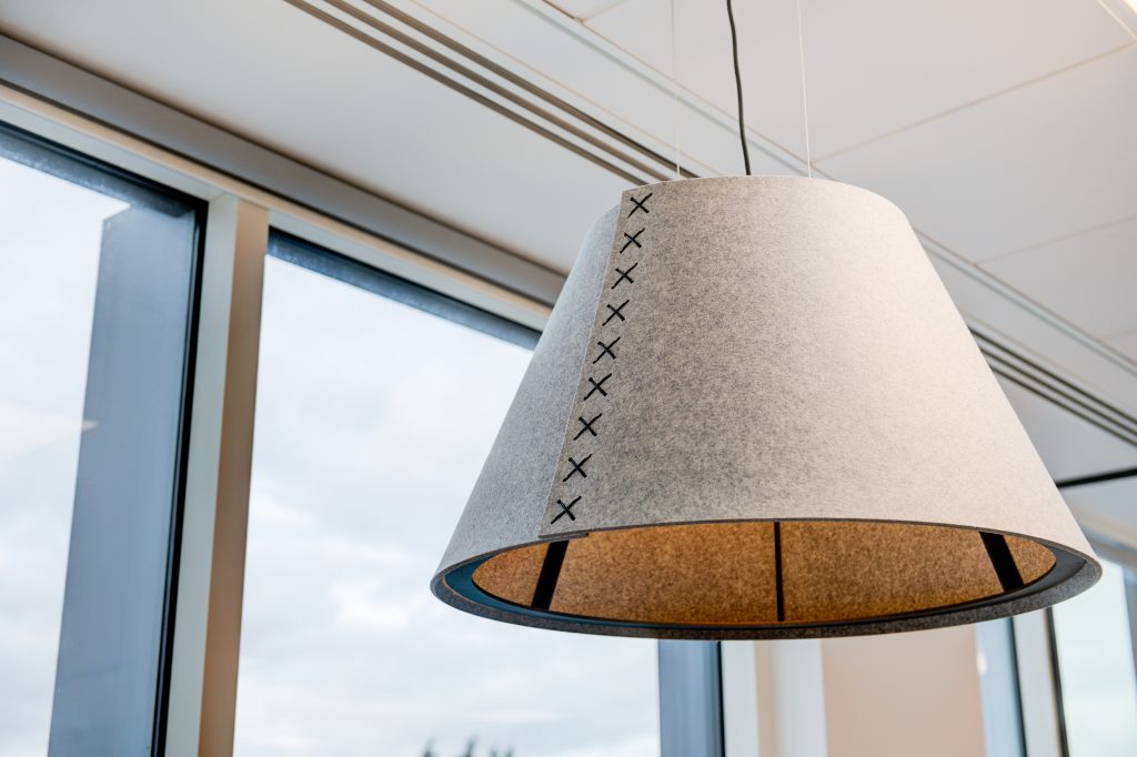
We implemented a soft palette to compliment the bold paint work; white wood effect flooring laid on a 45-degree angle runs through 65% of the space. Smooth grey felt works in the space for aesthetics and acoustics, through the meeting booths and large acoustic shades above desking.
The sunshine room – what was the inspiration behind this?
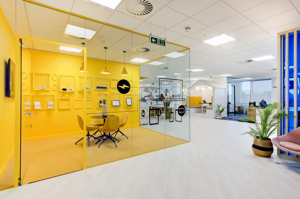
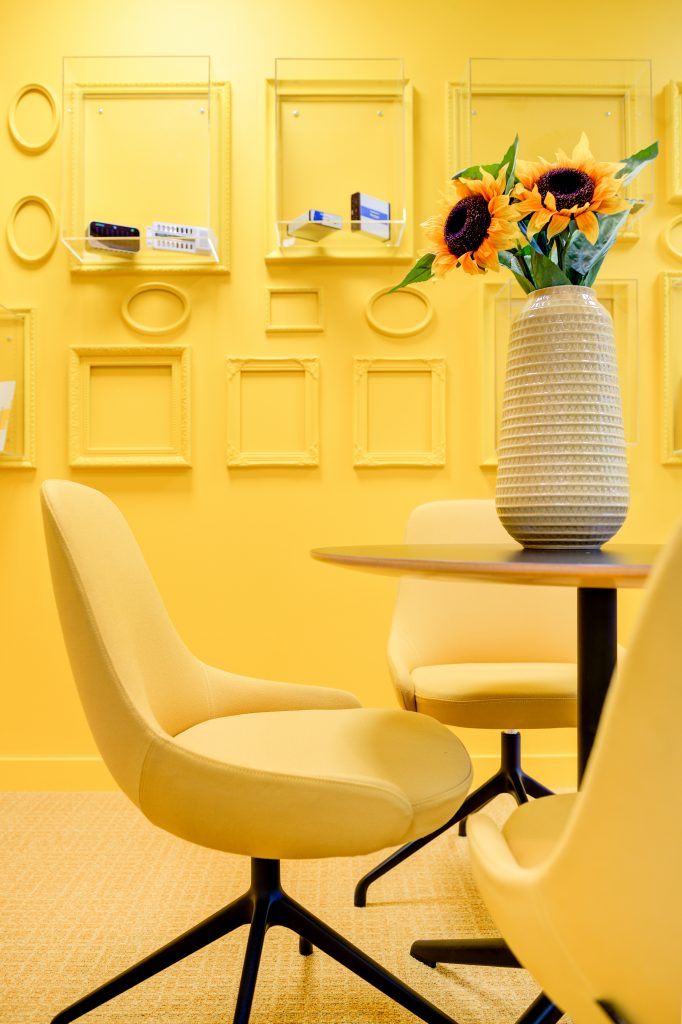
Due to the meeting room sitting in a corner away from any natural light, the inspiration came from bringing the sunshine further into the space. The design team had a challenge on their hands to perfectly match all the yellow finishes together, through fabric, paint, carpet etc.
How did you incorporate the branding into this design?
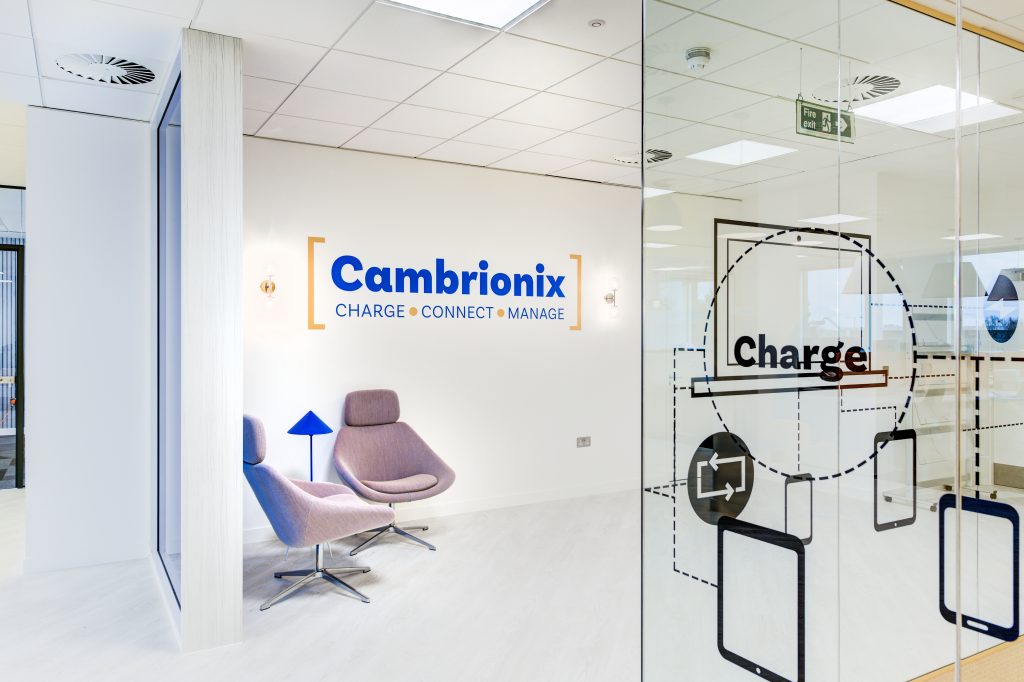
Taking inspiration from Cambrionix branding from both print and digital, our graphics team reworked ideas to suit fit for the office and messaging that we were trying to convey. Each element was perfectly planned around the 3D space, therefore curving around the meeting room glass, or fitting in below shelving.
Did you design this space with collaboration and employee satisfaction in mind?
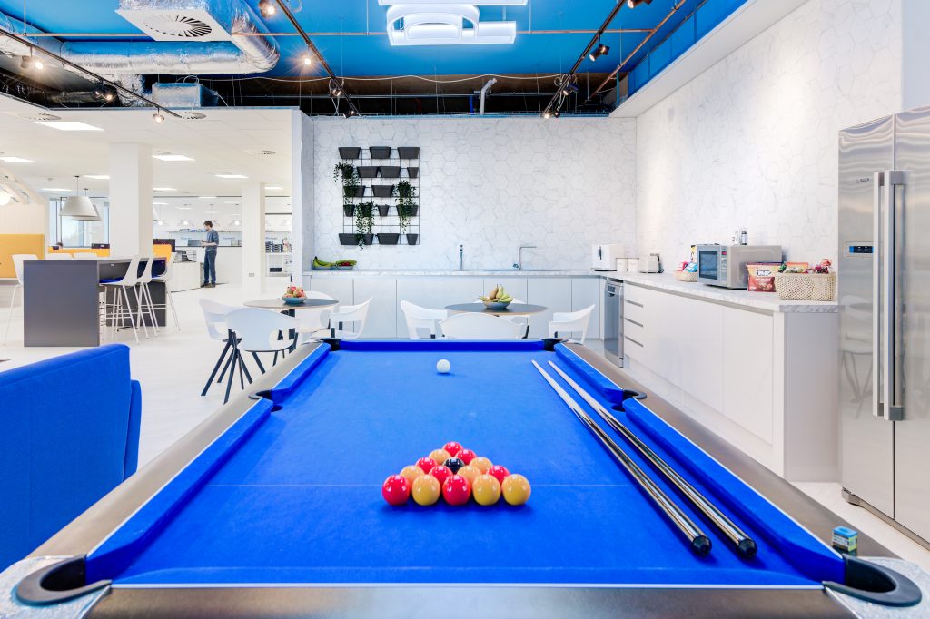
Most definitely, we designed this office to be both work and play. The team at Cambrionix believe in staff wellness and having the opportunities to all come together as one team. Therefore, we put as much detail into the breakout as we did in the main office space. Both needed considerations as to how these spaces would be used on a daily basis to keep all team members satisfied and free to use the office how they want to.
To explore the full project case study, click here